As discussed in Chapter 2, the physiological response to color has three properties:
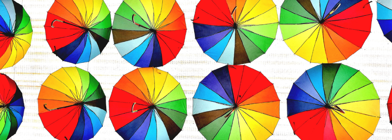
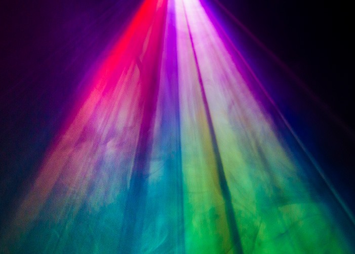
Hue: which is simply the unique color, such as “red” or “green” determined by the wavelength of light emitting, transmitting, or reflecting
Chroma: is the saturation of a color, and is determined by how “pure” a color may be. Simply, does the color appear to have any white in it?
Brightness: is the relative lightness or darkness of a color. If we assume that typical human vision has a contrast ratio of 1 to 100, 100 would be the brightest spot and 1 would be the darkest.
A reasonable starting point in creating a system that identifies color would be to start with the hues in a spectrum. The electromagnetic spectrum stretches far into radio waves on one end and gamma rays on the other end, so it makes sense to illustrate it as a continuous line.
However, human vision is only concerned with the visible spectrum. Additionally, as we’ve discussed, the two hues on either end of the spectrum, red and blue, blend into each other to make purple or magenta, creating a continuous loop where every visible wavelength visually blends into the next in a linear fashion. In other words, red gradually transitions into orange, then into yellow, then to green, and so on. As such, it makes sense to illustrate the spectral colors as a two-dimensional color wheel where the spectral colors take up two-thirds of the space, and the nonspectral purples/magentas take up the other third:

Now that we have two dimensions instead of just blending adjacent colors along the x-axis, we can blend colors across from each other, radially, such as yellow with blue, green with red, or any other combination. As it happens, due to the sensitivity curves of the cones, colors across from each other are considered complementary on most color wheels and typically blend into a neutral hue nearing white. In other words, colors away from the center of the wheel have a high chroma and appear saturated, and as we move toward the center, the “purity” of the color is reduced.

Now we need to account for brightness and the non-spectral hues associated with it, such as brown, pink, gray, white, black, and so on. Since there is a light and dark version of every color (such as “light blue” or “dark blue”), we could illustrate brightness within the third dimension:
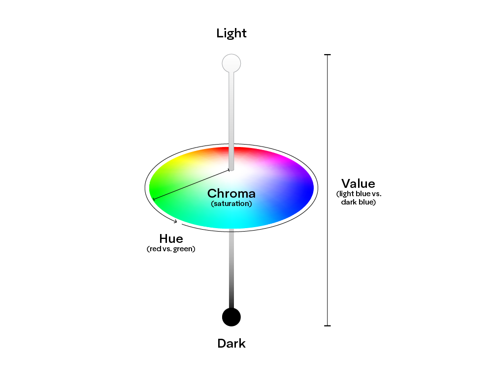
Combining the three dimensions gives us a “color space” where we can organize colors in a way that best fits our application. Color spaces come in various three-dimensional shapes, from cubes, to spheres, to cylinders, and more. Perhaps one of the oddest and most widely used shapes is the “blub” found in the CIE 1931 Chromaticity Diagram, which gets its more organic shape from the fact that we do not perceive colors evenly. As discussed in Chapter 2, we are more sensitive to changes in hue, chroma, and brightness of some colors than others. In the next chapter, we will discuss why CIE 1931 is so widely accepted as the best “measuring stick” for quantifying color in most industries, including the traffic industry.