As discussed in Chapter 4 of our Retroreflectivity module, Illuminance (E), measured in lux, is the amount of visible light falling on a surface per unit area, while Luminance (L), measured in cd/m^2, is the intensity of visible light coming from a surface per unit area. The relationship between scene illumination (E) in lux, and the luminance of the scene (L) in cd/m^2 is simply:

Where ρ measures how much light reflects from a particular surface.
Taking a typical outdoor scene of about 75,000 lx and a reflection factor of 0.90 from the brightest surface in the scene, we get:

The surface with the highest reflection factor in a scene is typically perceived as white (as long as it has a somewhat neutral color) and is known as the scene white. Our brains then "calibrate” our eyes and expectations to determine what other colors should look like.
Take standard colored traffic signs, for example. Any one sign seems more or less perceptually the same color during various times of the day, weather conditions, or even different types of headlights–a yellow sign, for example, is still perceived as yellow by most drivers regardless of weather conditions, headlight color, time of day, etc. This is known as color constancy and occurs because we are cognitively discounting the color of the illumination based on the brightness and hue of the scene white. Our brains are essentially factoring in the spectral power distribution and intensity of the main light source in a scene and calculating how the objects in that scene interact with it. This subconscious process determines if something is lighter or darker than it should be and produces non-spectral colors like gray, “light red," "dark red," fluorescents, and so on.
A common example is the color brown, which is actually a darker shade of orange. From a physics standpoint, brown has the same wavelengths as orange (near 600 nm) but has a relatively lower brightness. In other words, brown objects reflect wavelengths of light near 600 nm but with less intensity than something that is orange. Without information about the light source or the scene white, it would be difficult to determine if something is brown or orange.
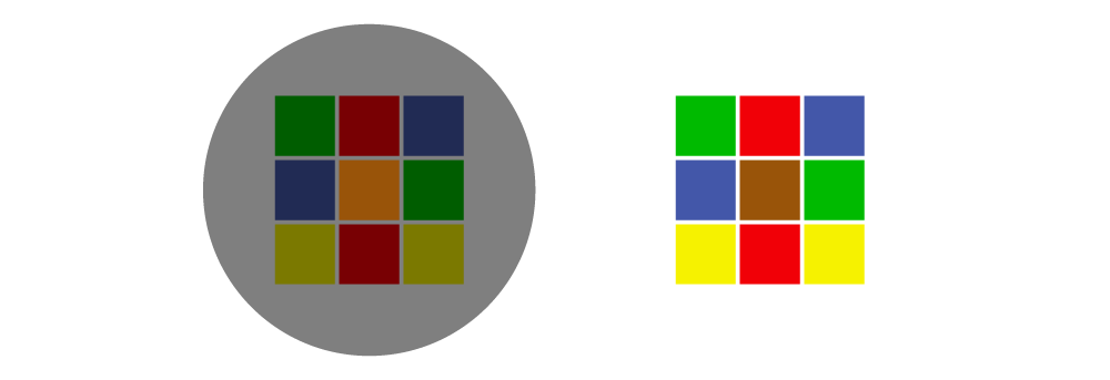
In the two images above, we have nine colored tiles on each side. Based on the brightest parts of the scene (typically anything white on the screen), our brains determine how bright each colored tile should be. Even though most of the colors in the left image are technically darker, if each image was shown individually, most would perceive them to be the same color–blue would be blue, green would be green, and yellow would be yellow.
The difference is the center tile, which most perceive as brown on the right, but orange on the left. However, if we extend one side to reach the other, as done below, we see that the center squares are technically the only ones that are the same exact color.
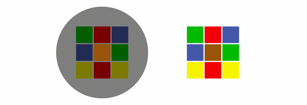
This illusion occurs because we expect that the colors on the left should be darker. We automatically consider the color and intensity of the light on the darker side based on context and our experiences of what each color should look like. By keeping the brown tile the same color on both sides, our brains assume the left tile is brighter than it should be, so it must be orange. This post-vision processing happens so automatically by the brain that, typically, the illusion can't be undone even after the viewer knows the solution.