When approaching a sign, color is typically the first identifiable feature, making it a critical consideration. Color coding of highway signs developed slowly over time, and it was based on many factors, including need, available information, technology, and manufacturing capabilities, to name a few. The first color code, introduced in 1927, recommended white, black, yellow, and green. Red, orange, and blue were added later, up to 1961. Fluorescent yellow-green was added in the early 1990s, while fluorescent yellow was allowed towards the end of the 1990s as pigment technology improved and research advanced.
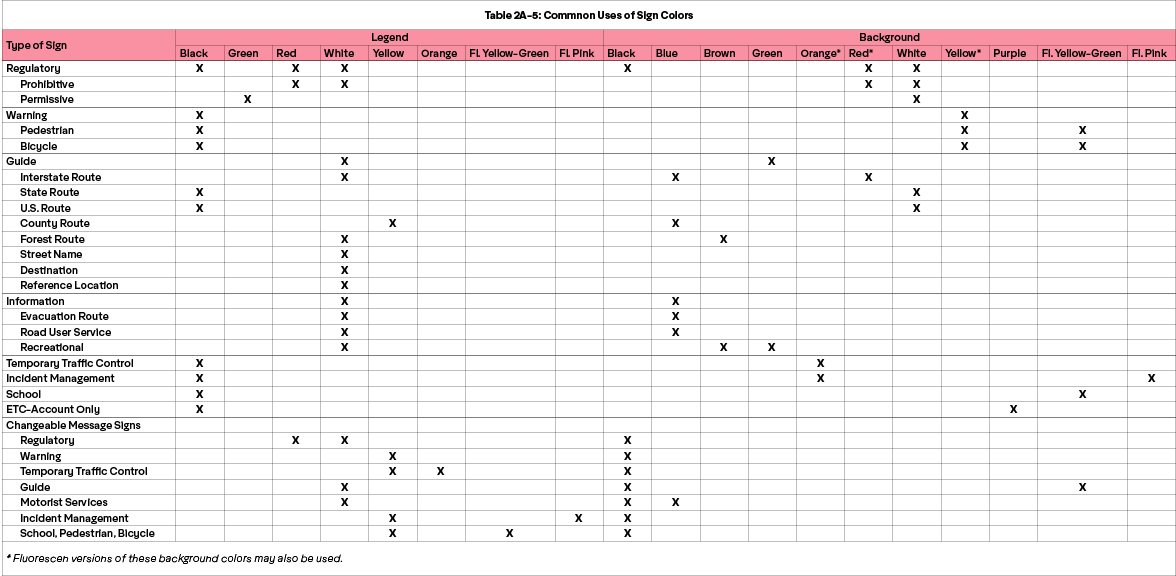
Today, the US Manual on Uniform Traffic Control Devices (MUTCD), published by the FHWA includes a total of 19 colors (20 if you count “silver”). Section 2A.10, Table 2A-5 outlines their usage:
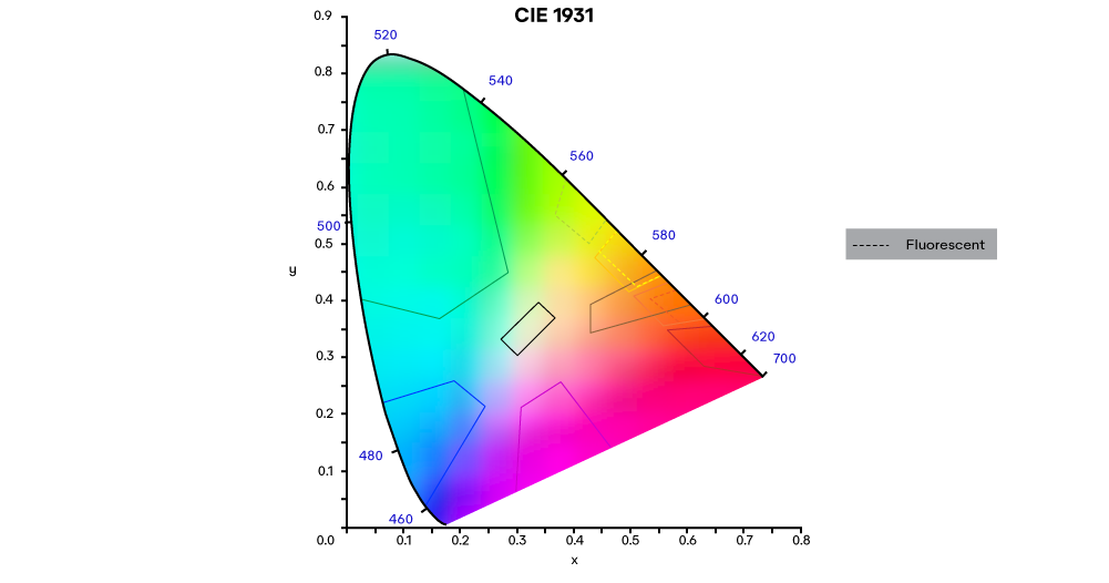
Most people are familiar with the color cards found at a paint store, where you pick a color and view it under different lights to see how the color looks. Another common method is the Pantone Matching System (PMS), where a three or four-digit number is assigned to thousands of colors. Color specifications for signs are somewhat unique in that they reference a region within CIE 1931, using “color boxes”.
The use of color boxes in the traffic industry as opposed to Pantone colors for graphics applications, for example, makes sense for multiple reasons: for one, it is difficult for an engineer specifying signs to account for different headlights and their Spectral Power Distribution (SPD) (Chapter 1). Additionally, for highway sign color coding to be effective, drivers must correctly identify the intended color. For example, a driver needs to know a sign is “red,” regardless of its hue, saturation, or brightness. Once a driver identifies a sign as red, they should know the type of message it will likely have, regardless of its exact appearance. Finally, most signs last for well over ten years, so some color shift is expected; as long as the color is still identified correctly by most drivers, it is meeting its intended purpose.
To address these variations, sign specifications refer to a region within the CIE 1931 color space by providing a set of x and y coordinates. These coordinates are plotted on the CIE 1931 color space and, when the coordinates of each set are connected, they create a “color box.” Any sample that measures within the color box is considered to be passing.
Here is an overview of the color coordinates within ASTM D4956 and the “boxes” they create:

These color boxes are based on many factors. In short, for a sign color to be effective, it must be mass-producible, durable, testable, and have a high probability of being identified and soliciting the correct response from drivers and road users.
Because many factors impact color perception, including biological differences, context, experience, and culture, not everyone will always agree on the appearance of a color. As such, sign color research typically considers whether at least fifty percent of participants identified the intended color.
Sign color is a topic of ongoing research, but one report that helped shape many of the color boxes used by the FHWA today is a 1988 NISTIR report (88-3894), Evaluation of Colors for Use on Traffic Control Devices. In it, the researchers compare and contrast many of the international color specifications used for signs at the time, including ISO, ANSI, and other US agencies, and elaborate on the importance of having a specific highway standard that better considers headlights and retroreflectorized materials.
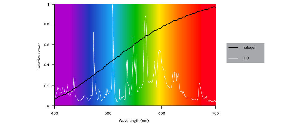
At the time of the report, High-Intensity Discharge (HID) headlights would soon roll off production lines. Though much more efficient, relative to tungsten or tungsten-halogen headlights, HID lights had poor color rendering capabilities because, as seen below, their Spectral Power Distribution (Chapter 1) doesn’t have the same wavelengths of light available in it:
Another consideration in the paper worth noting is the difficult decisions that sometimes need to be made as different colorants, headlights, and driver perceptions are balanced. The researchers found that in some instances, subjects would see blue as green, or vice versa, requiring further separation between the color boxes. At other times, red would be seen as orange or brown due to the type of headlight, retroreflective material, and/or some other factor, and so those color boxes would have to shift. And because red signifies a prohibited action, it should be given a higher priority.
The paper goes into a lot of detail regarding vision deficiencies, material availability, testing challenges, and more, and it provides insight into the challenges associated with creating color specifications for retroreflective material that need to be perceived similarly in daytime (diffused light) as well as nighttime (retroreflected light), in a variety of viewing conditions, for a large number of people, and for a critical application.